Lesson 1.2 displaying categorical data – Lesson 1.2: Displaying Categorical Data delves into the realm of data visualization, exploring techniques for effectively presenting categorical variables. Categorical data, a prevalent type of data in analysis, poses unique challenges in its representation. This lesson unravels the intricacies of categorical data display, empowering analysts and data enthusiasts with a comprehensive understanding of its visualization.
From the construction of tabular representations to the utilization of bar and pie charts, this lesson provides a thorough examination of the most commonly employed visualization methods. Advanced techniques, such as heatmaps and treemaps, are also discussed, expanding the repertoire of visualization options.
By delving into the principles and best practices of categorical data display, this lesson equips readers with the knowledge and skills necessary to convey data insights with clarity and impact.
1. Understanding Categorical Data

Categorical data refers to qualitative data that represents distinct categories or groups. It does not involve numerical values or a meaningful order. Categorical variables commonly encountered include gender, occupation, education level, product category, and region.
2. Displaying Categorical Data in Tables

HTML tables provide a structured and tabular format for displaying categorical data. To create a table, use the
. Proper formatting and structuring ensure clarity and readability.
3. Using Bar Charts for Categorical Data VisualizationBar charts are a graphical representation of categorical data using rectangular bars. Each bar represents a category, and its height or length corresponds to the frequency or count of observations within that category. Bar charts offer a visual representation of data distribution and comparisons between categories. 4. Pie Charts for Categorical Data Representation
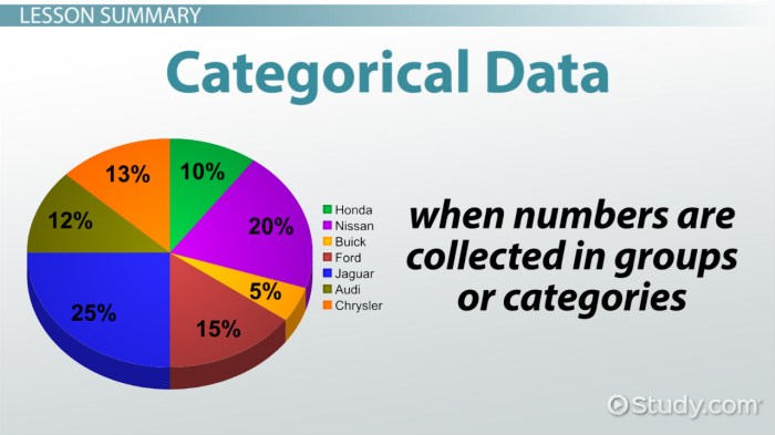
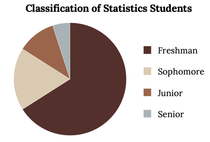
Pie charts represent categorical data as slices of a circle, where each slice represents a category and its size corresponds to the proportion of observations in that category. Pie charts provide a quick visual overview of data distribution but can be misleading if categories have small or similar proportions. 5. Advanced Techniques for Categorical Data DisplayAlternative visualization techniques for categorical data include heatmaps and treemaps. Heatmaps use color gradients to represent data values within a grid, providing a visual representation of data patterns and relationships. Treemaps display hierarchical data using nested rectangles, where the size of each rectangle represents the value of the corresponding category. FAQ Explained: Lesson 1.2 Displaying Categorical DataWhat are the key characteristics of categorical data? Categorical data is qualitative in nature, consisting of distinct categories or groups. It is non-numerical and cannot be ordered or ranked in a meaningful way. What is the primary benefit of using bar charts for categorical data visualization? Bar charts are effective in displaying the distribution of categorical data, allowing for easy comparisons between categories and the identification of patterns and trends. What are the advantages of using pie charts to represent categorical data? Pie charts provide a visual representation of the proportion of each category in relation to the whole. They are particularly useful for highlighting the relative sizes of different categories. |
